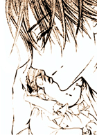
I actually think chapter 66 is pretty good compared to other drawings because of its emphasis to yuki's expressions

its probably the pointedly single emphasis on Kaname and Yuki that made it horrible. for example this
http://manga.animea.net/vampire-knight-chapter-66-page-1.htmlis a great cover, even sideways you can see the emotion in their eyes...

here yuki looks childish, then lustful on the same page
http://manga.animea.net/vampire-knight-chapter-66-page-13.htmllater on she looks very mature and adult here:
http://manga.animea.net/vampire-knight-chapter-66-page-15.htmland childish again here:
http://manga.animea.net/vampire-knight-chapter-66-page-17.htmlshe changes aura/feel per page, its like we're seeing different emotions in one chapter. and here kaname has a new expression thats so cute and quite unlike him, its very light
http://manga.animea.net/vampire-knight-chapter-66-page-17.htmla faint hint of surprise, then smile

the chapter is very light and comedy for both kaname and yuki, and possibly this is a chapter where you can see the variation of expression
--
@topic
I prefer the latest chapters drawing now for the following reasons
>>EYES: in the first few chapters the drawings had large, marbly eyes, so large and bright it looks more like stones than actual eyes (reminiscent of hino's previous work such as Wanted and Meru Puri, the eyes are the same)
http://manga.animea.net/vampire-knight-chapter-3-page-28.htmlhttp://manga.animea.net/vampire-knight-chapter-3-page-30.htmlhttp://manga.animea.net/vampire-knight-chapter-6-page-9.htmlhttp://manga.animea.net/vampire-knight-chapter-7-page-42.htmlunlike the recent ones the eyes had more luster/sparkle and expression than this, it seems like the ones who work the expression in the first few chapters are the eyebrows, not the eyes lol
>>HANDS: the hands are drawn uncannily large and claw-like that lacks grace
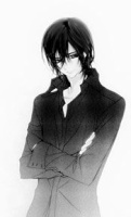
http://manga.animea.net/vampire-knight-chapter-7-page-24.html>>HAIR: kaname's hair has a literally wet, drippy look, as if he just got out of bath and didn't dry it
http://manga.animea.net/vampire-knight-chapter-5-page-27.htmlack.

>>PROFILE:
It looks just as if Yuki is staring into space.
http://manga.animea.net/vampire-knight-chapter-5-page-32.html>>HEIGHTS: and the heights stayed true to fanbook so the end result is Zero looks like a giant while Yuki looks like a 10 year old instead of 16
http://manga.animea.net/vampire-knight-chapter-6-page-32.htmlhttp://manga.animea.net/vampire-knight-chapter-6-page-31.htmlhttp://manga.animea.net/vampire-knight-chapter-15-page-24.htmlhttp://manga.animea.net/vampire-knight-chapter-21-page-30.html---
GRADUAL CHANGE
around volume 3 the changes began to take place and you can see it developing
http://manga.animea.net/vampire-knight-chapter-14-page-22.htmlthe eyes had a more gentler, innocent feel that was totally absent in vol1-2
this continued until the second arc, with much more emphasis on drawing details hence compromising the number of paneling in each page
http://manga.animea.net/vampire-knight-chapter-49-page-15.htmlhttp://manga.animea.net/vampire-knight-chapter-49-page-17.htmlhttp://manga.animea.net/vampire-knight-chapter-49-page-31.htmlthe expression of the eyes is superb, and the amount of detail placed on it.
http://manga.animea.net/vampire-knight-chapter-69-page-28.htmlthere's more detail on the hair movements
http://manga.animea.net/vampire-knight-chapter-49-page-30.htmlthe hands are more graceful and the heights are appropriate, the shadowing adds to the feel of the moment
http://manga.animea.net/vampire-knight-chapter-49-page-32.htmlthe bad thing:
-Zero's expression became sooo blank now his expression was totally killed.

there's hardly any change at all
here he looks like frankenstein because of the utter void in emotion
http://manga.animea.net/vampire-knight-chapter-53-page-37.htmlso ugly... he hardly changed expression and only did when he felt sarcastic or wanting to kill
this was an utter loss compared to the first arc, where he was shown to be the most expressive character due to his oppressive moments
-Yuki's long hair
sometimes looks like she wears a wig and it doesn't sit right on her head
http://manga.animea.net/vampire-knight-chapter-36-page-37.htmlif not it makes her look juvenile somewhat
http://manga.animea.net/vampire-knight-chapter-68-page-23.htmlhere her hair looks so flimsy, it lost its full bodied feel before
http://manga.animea.net/vampire-knight-chapter-71-page-18.html-the large drawings take up most of the page and the amount of panelling is lost so there's so few things going on in a chapter other than Yuki's expressions.
-there are also few backdrops and details but I often see this midway on a long manga so its ok
but other than that things have gotten more interesting since the first arc and I love the drawings, it is after all what makes VK great

I prefer the things going on right now despite its disadvantages~


 Here we don't have a background...LOL

 I know for sure that in cases where you want to project more a character and the others around him/her are just "fillers", you can draw all the fillers without faces at all


 I'm probably wrong
  They've both gotten so hot in recent chapters I don't even really know who I want Yuuki to end up with anymore


» Our Kaname is here!! Vampire Knight memories chapter 38
» Vampire knight Memories 38
» Where to Find Vampire Knight Memories Translation
» The Final Countdown
» New VK Chapter is HERE!
» Links for Other Vampire Knight Forums and Sites that you like and enjoy!!
» VK Memories CH 6!
» VK Memories
» New VK Chapter SPOILERS!
» New VK Bonus Ch!!
» Translation of 'Fleeting Dreams'
» Bunko Editions
» New Vampire knight Extra
» The Musical (Original and Revive)
» NEW CHAPTER IN 2015?
» Newbie in the forum...
» Who do you think Yuki loves more: Kaname or Zero?
» Zeki or Yume?
» So What will happen of Kaname?